
The inflection point
Since our founding two and a half years ago, Anvil has been working to bring together disjointed paper processes into a cohesive digital experience and it’s time that our brand identity did this justice. In that time, we’ve been moving fast to build a product that enables our customers to do their best work.
While we are proud of the Anvil we’ve put out into the world in that time, it has been undeniably hard to prioritize a scalable and cohesive brand experience. Anvil is a powerful and flexible platform that can solve many problems, which makes it even harder to consistently articulate what Anvil is, means, and stands for.
The first step on this journey was to define Anvil’s foundational brand attributes. After a number of internal and external interviews, we distilled three themes as the bedrock of our brand: trust, approachability, and engagement.
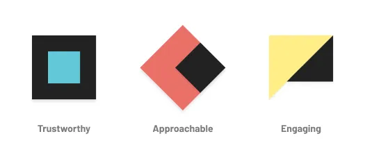
Trustworthy
First and foremost, Anvil is trustworthy. At our core, we are dependable and robust. Our users should feel confident that we are able to solve their most complex problems. We are respectful and professional, understanding that our users are here to get their work done and we are in service of that goal. Most importantly, we understand that the data that we steward is a matter of life and livelihood: we strive toward top quality compliance and security in all that we do.
Approachable
Secondly, Anvil is approachable. We understand that for critical daily operations, most businesses rely on paperwork, and we respect the decisions and constraints of how that paperwork is collected today. However, we believe there is a better way to enable these operations and our job is to bridge that gap in a way that is approachable, attainable, and accessible. We want to build better processes together and believe our users shouldn’t have to adapt their business to ours. We know that clean does not mean simple, so we take the complex and strive to organize it for our users and theirs.
Engaging
Lastly, Anvil is engaging. We are enthusiastic about enabling others to do their most meaningful work and care deeply about the people behind the paper. We don’t presume to know everything and are always eager to learn more. While we are professionals, we have a passion for what we do and a flair of personality that separates us from a pack of incumbents. We don’t automate for the sake of technology, we automate for the sake of humanity—reducing human error and repetitive work to unblock relationship building.
This is what Anvil represents, and our updated branding does a better job of capturing these sentiments.
A brand new Anvil
Taking a closer look at our original logo, the atomic unit of brand identity, the identity crisis is clear. Simultaneously authoritative and whimsical, our original logomark and wordmark didn't play well together. Previously, our logo got lost at small sizes where detail was hard to maintain and did not assert itself as trustworthy and professional in a lineup of our partnered financial institutions and publications. Our new logo now holds its own with our peers.
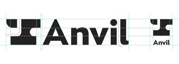
The new logomark, paired with a custom wordmark, works in a multitude of sizes and compositions ensuring that the Anvil brand is flexible for all applications.
Beyond our logo, other elements of our new branding are built upon our common brand attributes. Our new brand leans in on bold type, favoring heavier font weights to maintain a strong type hierarchy and make complex content easier to consume. The typeface itself, with its open counters and subtly rounded terminals, is legible without being aggressively sharp.
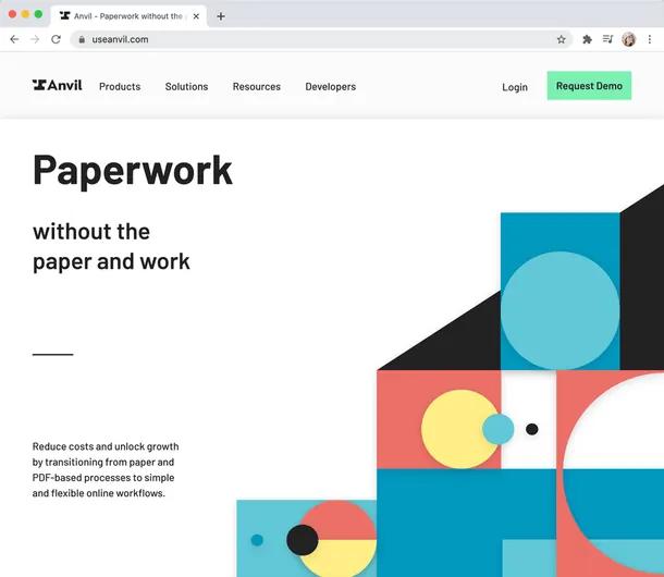
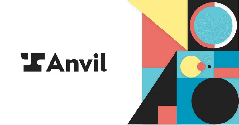
Perhaps the biggest shift in our brand style is the introduction of abstract illustrations that incorporate bold but familiar geometric compositions. Incorporating shadows into our illustration style, we evoke the idea of cut paper layers in real physical space, alluding to our role as a bridge between the analog and digital world. We further incorporate playful nods to paper processes of the past with our color pallet, riffing on traditional printing CMYK values as accents. We have, however, opted to keep our distinctive mint green primary brand color as an acknowledgment of our own past as we evolve into the future.

We hope you love the new Anvil brand identity as much as we do and join us as we continue our journey to transform how information is intentionally shared. With the launch of our newly updated website, we'll now be turning our attention to infusing our product offerings with the trust, approachability, and engagement our brand is built on. This will ensure that every interaction with us remains consistently and authentically Anvil.