

Nothing feels worse to a new user than having to navigate across a slow-performing webapp. Nine out of ten times, I hit 'back' on a webpage once I realize a page is rendering excruciatingly slow. Webapp performance is one of the most important components of user experience, and that is why search engines take into account website metrics such as 'first contentful paint' or 'time to interactive' when ranking.
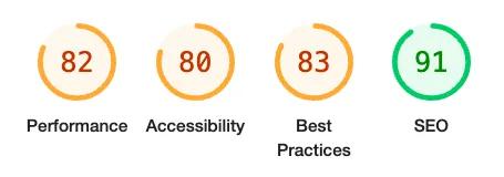 Lighthouse metrics for an example webpage
I'll assume you already have some working knowledge on what styled-components is and how it works. But just in case, styled-components is one of the most popular open-source styling libraries, especially in the React ecosystem. Instead of applying styles to an entire webpage or specific HTML elements using the class/id system, you can apply styles onto individual React components. One of my favorite aspects of the styled-components approach is it neatly blends together logic & styling – JS, HTML, and CSS – so everything is accessible from just one file.
const StyledButton = styled.button`
  font-size: 14px;
  color: #525252;
  background-color: #7AEFB2;
  border-color: transparent;
`

const ButtonComponent = ({ isLoading, onClick, children }) => {
  return (
    <StyledButton className=”example-btn” onClick={onClick}>
      {children}
      {isLoading ? <LoadingSpinner /> : null}
    </StyledButton>
  )
}

export default ButtonComponent
Example styled component button in React
Now that we've covered the background, let's ask the important questions. How can we gauge how well our styled-components are performing? What metrics should we look out for? And what are some best practices we can implement to keep our code efficient?
Measuring performance
We'll be using Chrome DevTools' Performance Monitor to gauge a page's performance in real time. It will appear like this:
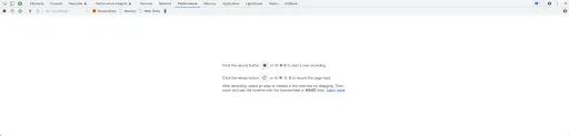 Chome DevTools performance monitor
Navigate to the page containing your code, open up the performance monitor, press record, perform an action, and stop recording. You'll see something like this:
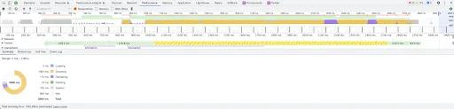 Performance timeline & summary
Looking at the summary, we can see scripting takes up the majority of the recording time – 1904ms out of 2880ms. It appears we can make the most significant improvements in this department. Let's dive further by clicking into the 'Bottom-up' tab.
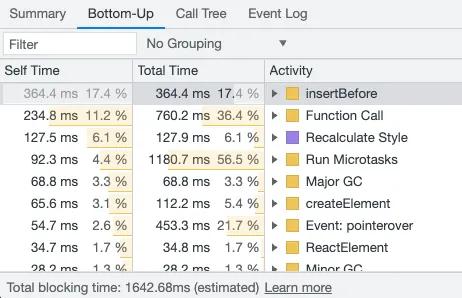 Performance Bottom-up tab
The 'insertBefore' scripting activity takes 364.4ms – the longest of any process. Let's figure out where this code comes from.
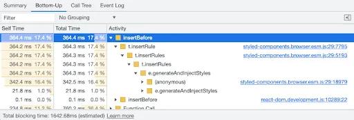
insertBefore subfolders
The code with the greatest 'Self time' comes from styled-components. Now that we've identified where the problem lies, let's fix it by making our code more efficient.
To learn more about using the DevTools performance monitor, check out this blog post about optimizing render performance!
Best practices
The first step in code optimization is to examine the way our code is structured. Let's take a look at some of those best practices for styled-components.
Dynamic styling
Oftentimes we want the styling of a UI component to be dependent upon some logic or state in the application. For example, we may want the background of a div to be gray when being hovered over. We can achieve this by applying dynamic styling.
const Field = styled.div`
  background: ${(props) => (props.isHover ? '#E2EEF0' : '#FFFFFF')};
`
Example of dynamic styling - div with light cyan background upon hover
What if we want multiple dynamic styles to be applied? It could look quite repetitive.
const Field = styled.div`
  color: ${(props) => (props.isSelected ? '#2D2D2D' : '#7A7A7A')};
  border-radius: ${(props) => (props.isSelected ? '4px' : '0px')};
  background: ${(props) => (props.isHover ? '#E2EEF0' : '#FFFFFF')};
`
Multiple dynamic styles - the 'meh' way
Let's clean up our code by importing the props once for each prop instead of doing it on a per-line basis.
const Field = styled.div`
  color: #7a7a7a;
  border-radius: 0px;
  background: #ffffff;

  ${({ isSelected }) =>
    isSelected &&
    `
    color: #2D2D2D;
    border-radius: 4px;
  `}

  ${({ isHover }) =>
    isHover &&
    `
    background: #E2EEF0;
  `}
`
Multiple dynamic styles - the okay way
Having a bunch of dynamic styles can quickly get complicated. Let's imagine we have a styled-component that takes a 'displayStyle' prop that applies various combinations of CSS. Like so:
const StyledInput = styled.input`
  font-size: 14px;
  border-radius: 2px;

  ${({ displayStyle }) =>
    displayStyle === 'compact' &&
    `
    border-top: none;
    border-left: none;
    border-right: none;
    padding-top: 0;
    padding-left: 0;
    padding-right: 0;
    margin-left: 0;
    margin-right: 0;
    font-size: 12px;
    box-shadow: none;
  `}

  ${({ displayStyle }) =>
    displayStyle === 'internal' &&
    `
    border: none;
    margin-left: 0;
    margin-right: 0;
    font-weight: bold;
  `}

  ${({ displayStyle }) =>
    displayStyle === 'large' &&
    `
    border: 2px;
    margin-left: 10px;
    margin-right: 10px;
    font-size: 22px;
  `}
  …
`
Another example of multiple dynamic styles - the okay way
It can get quite confusing to track all the CSS rules when there are a bunch of different display styles. We can compartmentalize everything by creating distinct styled-components for each display style.
const StyledInput = styled.input`
  font-size: 14px;
  border-radius: 2px;
`

const CompactInput = styled(StyledInput)`
  border-top: none;
  border-left: none;
  border-right: none;
  padding-top: 0;
  padding-left: 0;
  padding-right: 0;
  margin-left: 0;
  margin-right: 0;
  font-size: 12px;
  box-shadow: none;
`

const InternalInput = styled(StyledInput)`
  border: none;
  margin-left: 0;
  margin-right: 0;
  font-weight: bold;
`

const LargeInput = styled(StyledInput)`
  border: 2px;
  margin-left: 10px;
  margin-right: 10px;
  font-size: 22px;
`

export default function Input ({ displayStyle, …props }) {
  let InputComponent = StyledInput
  if (displayStyle === 'compact') InputComponent = CompactInput
  else if (displayStyle === 'internal') InputComponent = InternalInput
  else if (displayStyle === 'large') InputComponent = LargeInput

  return (
    <InputComponent {...props} />
  )
}
Multiple dynamic styles - the cleanest way
By adopting this improved format of structuring your styled-components, I hope you'll see some improvement in performance.
Global styles
Styled-components has a helper function named createGlobalStyle which generates a special component that handles global styles. The function works by creating a HTML style tag. Whenever a React component with createGlobalStyle is mounted, createGlobalStyle is called and a new style tag is generated. Using the helper function with a React component that is mounted & unmounted frequently will lead to redundant style tags in the DOM, so it is best to minimize the number of times the function is used.
const DropdownGlobalStyle = createGlobalStyle`
  .selected-option {
    background-color: #3E3E57;
  }
`

function Dropdown(props) {
  return (
    <>
      …
      <DropdownGlobalStyle />
    </>
  )
}

const InputGlobalStyle = createGlobalStyle`
  .error-container {
    color: #FB7578;
  }
`

function Input(props) {
  return (
    <>
      …
      <InputGlobalStyle />
    </>
  )
}
Using createGlobalStyle for multiple components - the bad way
Let's create global styles once only in the App component.
const AppGlobalStyle = createGlobalStyle`
  .selected-option {
    background-color: #3E3E57;
  }

  .error-container {
    color: #FB7578;
  }
`

function App() {
  return (
    <>
      …
      <AppGlobalStyle />
    </>
  )
}
Using createGlobalStyle once in the root component - the better way
Summary
We've covered how to measure the performance of your styled-components and best practices on structuring your code. By implementing these techniques into your development process, you can worry less about having a slow-performing web app!
We've applied these practices to our code at Anvil, and believe sharing our experience helps everyone in creating awesome products. If you're developing something cool with PDFs or paperwork automation, let us know at developers@useanvil.com. We'd love to hear from you.