
Reusable Storybook components and mocking requests
If you’ve worked on the frontend of an app before, you know how difficult it can be to test your components. Developing new components alongside existing code can be challenging when, for example, your component only shows in very specific situations. You would then need to repeat those situations every time when modifying and testing code.
You could also write your new components in a completely new app or layout within your frontend and develop them in the most minimal way possible, but now you’re now maintaining an entirely new app just for component development. There must be a better way. There is! It’s Storybook.
Storybook is an invaluable tool for developing your components in isolation. A developer can create components without the unnecessary mental load of other complex UI and logic that developing directly on the main app can bring.
In this post we’ll be looking at strategies on how to create components in Storybook that contain common behavior that can be reused throughout your Storybook stories. We will also look into Mock Service Workers (MSW) and how it can help test your components that interact with the network.
Reusable styling options with decorators
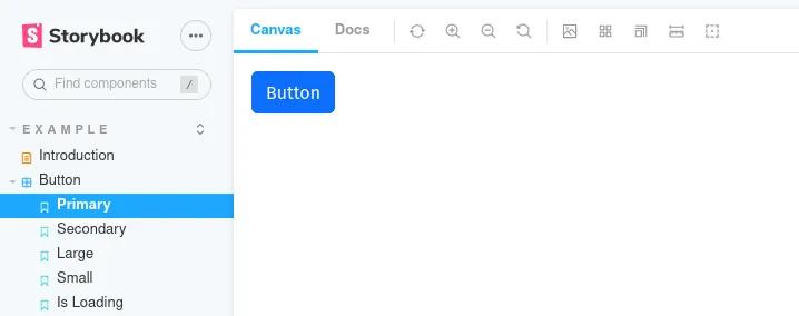
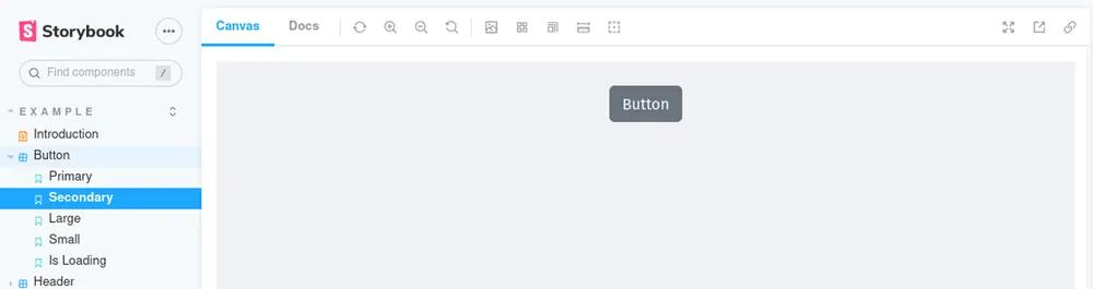
When developing with Storybook one common strategy is to have your component’s states as separate stories. These components would be shown in different states. For example, with the default Button component, we could show what it looks like in different sizes and how different props (i.e. primary={true}) affect the component.
After first installing Storybook, you’ll be given a default of example components as part of the installation. We’ll be looking at the provided Button component and its stories below.
// Below is the default when initializing Storybook via `npx sb init`
// with a few modifications.

// src/stories/Button.stories.tsx

export default {
  title: 'Example/Button',
  component: Button,
  argTypes: {
    backgroundColor: { control: 'color' },
  },
} as ComponentMeta<typeof Button>

const Template: ComponentStory<typeof Button> = (args) => <Button { ...args }
/>

export const Primary = Template.bind({})
Primary.args = {
  primary: true,
  label: 'Button',
}

export const Secondary = Template.bind({})
Secondary.args = {
  label: 'Button',
}

export const Large = Template.bind({})
Large.args = {
  size: 'large',
  label: 'Button',
}

export const Small = Template.bind({})
Small.args = {
  size: 'small',
  label: 'Button',
}

export const IsLoading = Template.bind({})
IsLoading.args = {
  label: 'Button',
  isLoading: true,
}
If you’d like to customize more of your components’ layout, you could update the Template variable above, but that would then make it into a specialized component just for these Button stories. What we want is something that we can also use on more than just the Button stories. We can do better with Storybook decorators.
Decorators in Storybook are components that add functionality to your component by wrapping around your component and optionally add/modify props on your component. Let’s take a look at a simple one below.
// src/stories/decorators/withStyle.tsx

import { ComponentStory } from '@storybook/react'

const withStyle = (StoryComponent: ComponentStory<any>) => {
  return (
    <div
      style={{
        display: 'flex',
        justifyContent: 'center',
        backgroundColor: '#EFF1F5',
        height: '100vh',
      }}
    >
      <div style={{ margin: '25px' }}>
        <StoryComponent />
      </div>
    </div>
  )
}
Then add the new withStyle decorator to our stories.
// src/stories/Button.stories.tsx

import withStyle from './decorators/withStyle'

export default {
  title: 'Example/Button',
  component: Button,
  argTypes: {
    backgroundColor: { control: 'color' },
  },
  // Add an array of decorators
  decorators: [withStyle],
} as ComponentMeta<typeof Button>

// …
Without changing Template and Button stories, the withStyle decorator changed the styling of all the stories in the Button category. If we wanted this same style on other stories, we would simply import and use the withStyle decorator.
Additionally, we can leverage the Storybook addon knobs to make the decorator be even more flexible by accepting user-provided changes.
After installing the plugin with your package manager (see the above link for installation instructions), we can create a new decorator component.
// src/stories/decorators/withResizableContainer.tsx

import { ComponentStory } from '@storybook/react'
import { text, color } from '@storybook/addon-knobs'

const withResizableContainer = (StoryComponent: ComponentStory<any>) => (
  <div
    style={{
      // knobs used here
      width: text('containerWidth', 'auto'),
      height: text('containerHeight', 'auto'),
      borderColor: color('containerBorderColor', '#000'),
      borderWidth: number('containerBorderWidth', 2),
      borderStyle: text('containerBorderStyle', 'solid'),
    }}
  >
    <StoryComponent />
  </div>
)

export default withResizableContainer
// src/stories/Button.stories.tsx

import withStyle from './decorators/withStyle'

export default {
  title: 'Example/Button',
  component: Button,
  argTypes: {
    backgroundColor: { control: 'color' },
  },
  // Update decorators here. Keep in mind that _order matters_, so the styles can look very different
  // depending on how you order your decorator components.
  decorators: [withResizableContainer, withStyle],
} as ComponentMeta<typeof Button>

// …
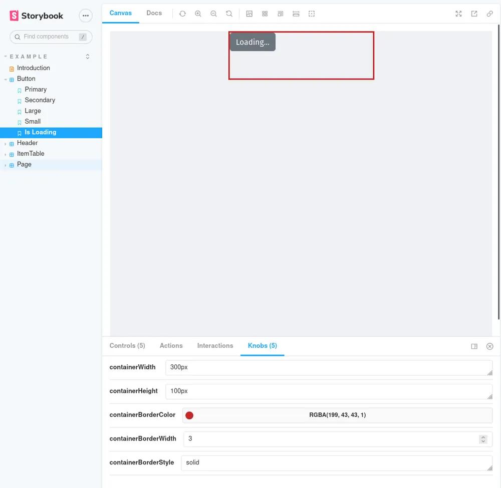
This new decorator has imports from @storybook/addon-knobs and those will populate the lower tab of your Storybook interface (shown below). This allows you to dynamically change any settings you’ve defined in your component.
Connecting and mocking requests
One downside of isolating components is that you don’t get the full experience of having components interact with your backend. Thankfully with Storybook, there’s an addon for that: Mock Service Workers (MSW)
If you’ve created unit tests, or any other type of automated testing, you may be familiar with mocks. Mocks can replace existing functionality or variables that would otherwise, for example, take a long time to calculate or go through other functionality that shouldn’t be considered part of the test.
In Storybook we can do the same, but with HTTP requests. If you have components that trigger HTTP requests, we can use the Storybook addon Mock Service Worker to intercept and set up different network situations for our components.
After installing the addon, we can add two more stories to our Button.stories.tsx file:
// src/stories/Button.stories.tsx

// … other imports here

// Add these for request and mocked request functionality
import axios from 'axios'
import { rest } from 'msw'

const mswHandlers = {
  handlers: [
    // Force an error on this route
    rest.get('/users/admin-things', (req, res, ctx) =>
      res(
        // Delay it for a second so we can see the loading indicator
        ctx.delay(1000),
        // Give it an error status code
        ctx.status(401),
        // Also give it an error message
        ctx.json({ errorMessage: 'Unauthorized' })
      )
    ),
    rest.get('/users/:id', (req, res, ctx) =>
      // Delay it for a second so we can see the loading indicator
      res(ctx.delay(1000))
    ),
  ],
}

export const FetchOk = Template.bind({})
FetchOk.args = {
  label: 'Will fetch data with MSW',
  primary: true,
  onClick: async () => {
    // This `axios` call could also be within your component(s) and `msw` will
    // still capture the request and handle it the same way.
    const res = await axios('/users/123')
    console.log('Clicked button', { res })
  },
}
FetchOk.parameters = {
  msw: mswHandlers,
}

export const FetchError = Template.bind({})
FetchError.args = {
  label: 'This will error',
  primary: true,
  onClick: async () => {
    // This `axios` call could also be within your component(s) and `msw` will
    // still capture the request and handle it the same way.
    const res = await axios('/users/admin-things')
    console.log('Clicked button', { res })
  },
}
FetchError.parameters = { msw: mswHandlers }
And on the Button component:
export const Button = ({
  primary = false,
  backgroundColor,
  label,
  size,
  onClick,
  ...props
}: ButtonProps) => {
  const [isLoading, setIsLoading] = useState(false)
  const [errorMessage, setErrorMessage] = useState('')
  const mode = primary ? 'btn-primary' : 'btn-secondary'

  const sizeMap: { [key: string]: string } = {
    small: 'btn-sm',
    medium: '',
    large: 'btn-lg',
  }

  const handleClick = async (event) => {
    setIsLoading(true)
    let res
    try {
      res = await onClick?.(event)
    } catch (e) {
      console.error({ e })
      setErrorMessage(e.message)
    } finally {
      setIsLoading(false)
    }

    return res
  }

  label = !!errorMessage ? errorMessage : label

  return (
    <button
      type="button"
      className={['btn', mode, sizeMap[size || '']].join(' ')}
      style={{ backgroundColor: errorMessage ? 'red' : backgroundColor }}
      onClick={handleClick}
      {...props}
    >
      {isLoading ? 'Loading...' : label}
    </button>
  )
}
Fetching default
Fetching with an error
With Mock Service Workers set up, we can now even test a simulated network request and set a custom delay. In this case we’re just keeping track of when the asynchronous HTTP request finishes by toggling the isLoading state before and after the request.
You can also provide MSW with JSON data that will be used as part of the response in order to test functionality like API calls without making real requests.
Conclusion
Hopefully this post exposes a few ideas on how to improve your Storybook development flow, or even helps you start on your Storybook journey. We at Anvil use Storybook extensively in our development process and have found it to be extremely useful. Do you have other Storybook tips and tricks that have helped you out? Let us know at developers@useanvil.com. Happy coding!